

How to Design an Office Layout for Productivity?
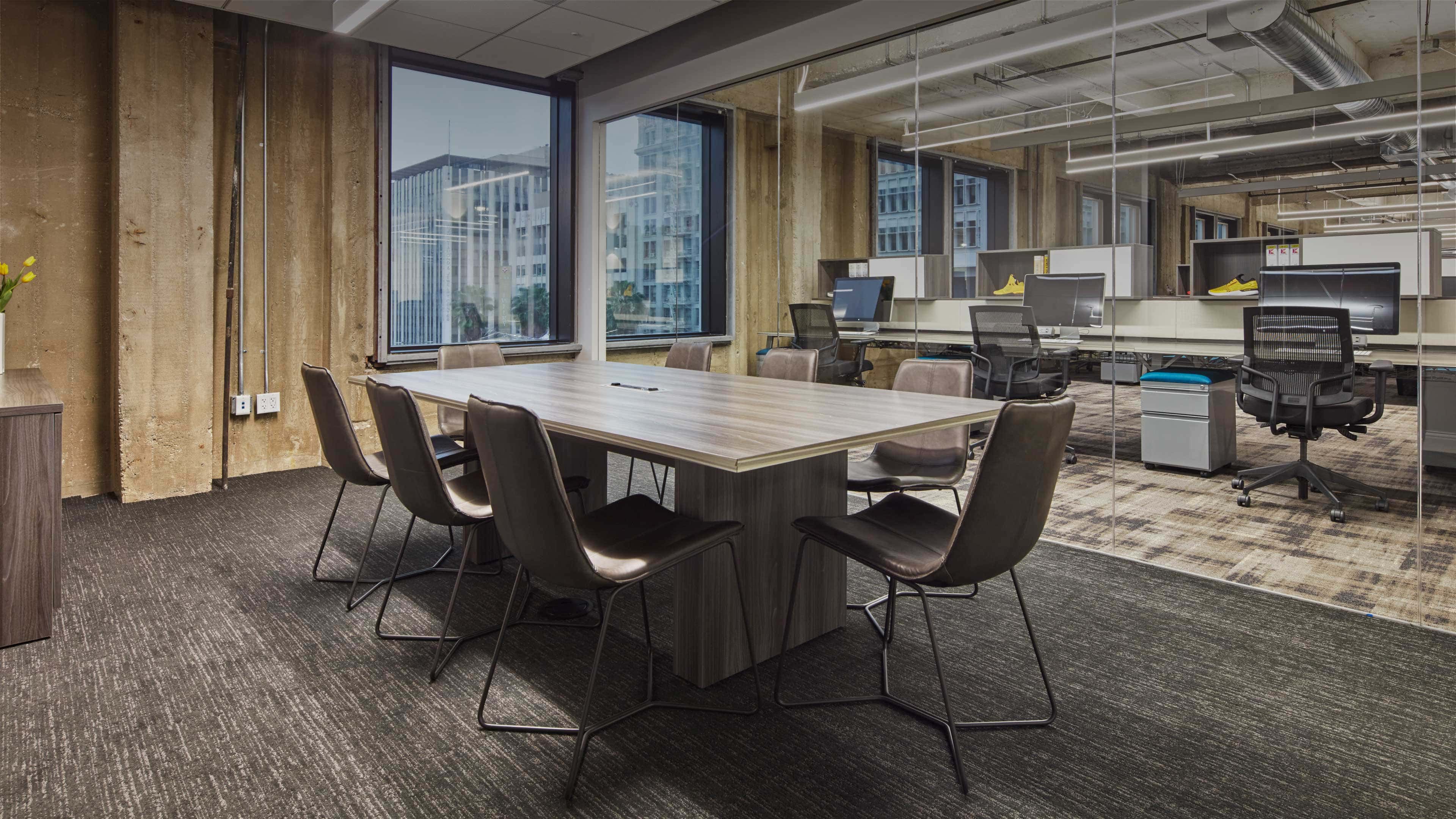
A productive office is not simply a room filled with desks. It is a working environment that helps people focus, communicate, and move through the day with less friction. Thoughtful office layout design considers how tasks, teams, and shared spaces interact. A quiet workstation may suit detailed work, while a small meeting area can support quick conversations without interrupting nearby colleagues. Even practical details matter: clear walkways, comfortable lighting, accessible power outlets, and storage close to where it is used.
The best arrangement depends on the people who use it. A growing team may need flexible desks, while roles requiring concentration may benefit from quieter zones. Start by observing how the office works now: note busy paths, unused corners, and places where noise gathers. Small changes can help. But no layout solves every problem. A beautiful floor plan may still feel awkward once daily routines begin. That is worth remembering.
This guide explains how to plan an office around real work rather than appearance alone. It covers space planning, work zones, furniture, lighting, acoustics, and ways to gather feedback before making costly changes. The aim is a layout that supports productivity without sacrificing comfort or collaboration. Test ideas where possible, then adjust based on how people actually use the space. A little uncertainty is normal. It can reveal what the plan missed.
Map work modes: open offices cut face-to-face interaction by 70% (HBR, 2018)
An office can look collaborative while making conversation harder. A 2018 Harvard Business Review report found that face-to-face interaction fell by about 70% after employees moved into open offices. More shared space did not automatically create more useful exchange. Noise, lack of privacy, and the pressure to avoid disturbing nearby colleagues can all change how people communicate.
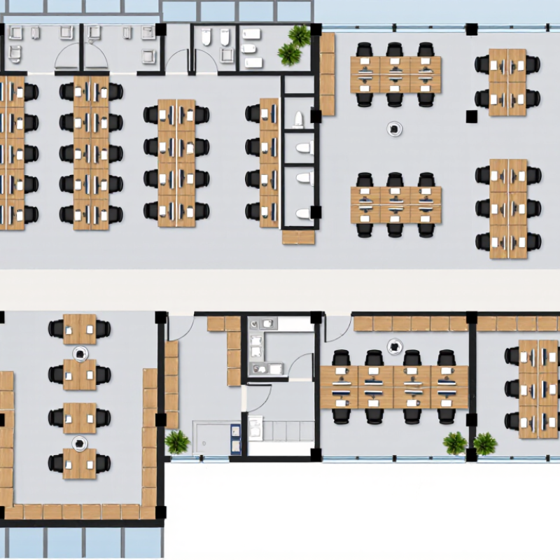
Map work modes before moving desks. Track when teams need focused work, quick questions, private calls, or group problem-solving. A project team might need a shared table for a morning planning session, then quiet desks for detailed work. Place small meeting rooms near collaboration areas, and keep phone booths away from quiet zones. Make routes to these spaces obvious. Quiet helps.
The map should reflect real behavior, not an ideal schedule. Ask employees where interruptions happen and which conversations have shifted to messages. A short observation period can reveal patterns, though people may act differently when they know they are being observed. That is a limitation worth noting. Test one zone at a time, then adjust based on feedback and simple measures, such as room use and reported focus. Some layouts will still feel awkward at first. Review them rather than treating the floor plan as finished.
Zone focus and teamwork: empowered offices lifted performance 32% (2010)
An office layout can make focus and collaboration feel like choices, not competing demands. The 32% performance lift cited for empowered offices in 2010 is a prompt, not a promise. Its meaning depends on how performance was measured and whether workers had real control over their surroundings. Context matters. A floor plan should support uninterrupted work and quick exchange, rather than forcing everyone into one mode.
Place quiet desks away from kitchen noise and busy walkways. Add acoustic panels, adjustable lighting, and a few small rooms for calls or concentrated tasks. Put shared tables near project materials, whiteboards, and power outlets, so teams can work without occupying quiet zones.
Keep routes between zones clear; a badly placed printer can turn a focus area into a corridor. Let employees choose where to work when their tasks allow it. A two-week pilot can reveal whether people actually use the spaces as intended.
Track practical signals, such as interruptions, room bookings, and staff feedback, rather than relying on a single productivity score. The layout may still frustrate someone. That is useful evidence, not a reason to ignore the problem.
Set ergonomic desk positions: OSHA recommends a 20–40-inch viewing distance
A productive office begins with a screen that does not make your neck lean forward. OSHA’s Computer Workstations eTool recommends a viewing distance of 20–40 inches. That range is a useful design target, not a fixed rule for every worker. Cornell University ergonomics guidance also uses arm’s length as a practical starting point. Measure from the eyes to the screen, then adjust for text size and vision.
Build that measurement into the desk plan. Leave enough depth for the monitor, keyboard, and forearms, while keeping the screen directly in front of the user. A tape measure helps: mark 20 and 40 inches on the desktop before placing equipment. If a large display sits too close, move it back or enlarge the text. Small adjustments matter.
Real rooms are messier. Desk depth, glasses, and changing tasks can all affect a comfortable viewing distance. OSHA also advises positioning the top of the screen at or below eye level, reducing the need to tilt the head upward. Check the setup while seated, not from a floor plan alone. A measurement can look right on paper and still feel wrong after an hour.
How to Design an Office Layout for Productivity? — Set Ergonomic Desk Positions: OSHA Recommends a 20–40-Inch Viewing Distance
| Layout Element | Practical Target | How to Set It Up | Productivity and Comfort Benefit |
|---|---|---|---|
| Monitor viewing distance | 20–40 inches (about 51–102 cm) from the eyes | Place the screen directly in front of the user. Adjust the distance to suit screen size, text legibility, and individual vision. | Helps reduce the need to lean forward and supports a comfortable viewing posture. |
| Monitor height | Top of the screen at or just below eye level | Raise or lower the monitor so the head stays generally upright and the eyes look slightly downward toward the center of the screen. | Encourages a neutral neck position during screen-based work. |
| Keyboard position | Close enough to keep elbows near the body and shoulders relaxed | Position the keyboard in front of the user, with the wrists straight and forearms roughly parallel to the floor. | Reduces reaching and helps maintain a relaxed upper-body posture. |
| Mouse position | Beside the keyboard and on the same working surface | Keep the mouse within easy reach. Move it with the hand and forearm rather than reaching outward from the shoulder. | Makes frequent pointer movements easier and limits unnecessary reaching. |
| Chair and foot support | Feet supported; thighs approximately level or sloping slightly downward | Adjust the chair so the lower back is supported. Use a footrest if the feet do not rest comfortably on the floor. | Supports a stable seated position and reduces pressure from unsupported legs. |
| Desk clearance | Enough open space for knees and legs to move freely | Keep storage, cables, and other equipment out of the main leg area beneath the desk. | Allows comfortable positioning and makes it easier to change posture. |
| Lighting and screen glare | Even task lighting with minimal reflections on the screen | Place the monitor away from direct glare from windows or overhead lights; use blinds or adjustable lighting when needed. | Improves screen visibility and reduces the need to squint or adopt awkward viewing angles. |
| Movement and task breaks | Change posture and take brief movement breaks regularly | Alternate seated tasks with standing or short walks when practical. Vary tasks rather than staying in one position for extended periods. | Breaks up prolonged static posture and supports sustained attention. |
The viewing-distance range is a general workstation guideline; adjust the setup to the task and the user’s comfort. Individual needs may vary.
Plan ventilation by occupancy: EPA reports indoor pollutants can reach 2–5× outdoors
An office can look bright and still feel stale by midmorning. The U.S. EPA’s The Inside Story: A Guide to Indoor Air Quality reports that indoor pollutant levels may run two to five times higher than outdoor levels, and sometimes more. That range is a warning, not a prediction for every room. Ventilation should respond to how many people use a space, and how quickly occupancy changes.
ASHRAE Standard 62.1 sets ventilation guidance for commercial buildings using both occupant numbers and floor area. In practice, a six-person meeting room may fill within minutes, while nearby desks stay half-empty. Plan outdoor-air delivery for peak room use, and give exhaust attention near printers, kitchens, and other pollutant sources. Keep supply diffusers clear of tall cabinets; blocked airflow can leave corners feeling stuffy. Small details matter.
Carbon dioxide sensors can help flag rising occupancy, but CO2 alone cannot measure every indoor pollutant. Pair readings with regular checks of airflow, filter condition, and occupant feedback. I would not treat one sensor reading as a verdict; doors opening and closing can distort the picture. That is easy to overlook. Use several observations before changing ventilation settings, and document what changed. EPA guidance also emphasizes source control, because removing a pollutant at its source can reduce the burden on ventilation.
Pilot the layout, then refine it using post-occupancy feedback and task data
Treat a new office layout as a working hypothesis, not a finished plan. Pilot one team or zone for four to six weeks. Before people move, record a baseline: desk use, meeting-room demand, noise complaints, and time spent searching for space. Choose measures tied to actual work. A team handling confidential calls may need enclosed rooms; a project group may need writable surfaces and quick access to colleagues. Do not count seat occupancy alone. An empty desk at 2 p.m. could mean focused work elsewhere, not wasted space.
Collect feedback through brief weekly check-ins and a post-occupancy survey. Compare it with task data: room bookings, peak usage, and observed bottlenecks. Protect trust by explaining what is measured, reporting patterns in aggregate, and avoiding individual tracking. Look for mismatches. If staff praise quiet zones but avoid them, test lighting, temperature, or distance from everyday work areas. Change one thing at a time, perhaps moving a printer or adding two small rooms. Then check the same measures again. Feedback can be uneven, and a small pilot may not represent every shift or role. That limitation matters. Record what the data cannot explain, revise the layout, and keep a channel open for staff to flag friction after changes.
Related Posts
-
Why Is Office Layout Design Important?
-
Top 10 Office Interior Design Trends for Global Buyers
-
2026 Top Office Layout Design Ideas for Global Buyers
-
Why Is Office Space Planning Important for Businesses?
-
Top Office Interior Design Companies in China?
-
The Best Trends in Commercial Office Interiors for Today?